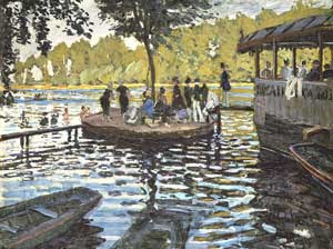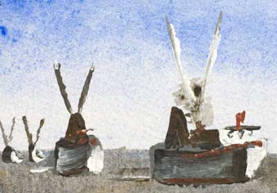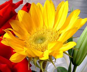
OK, I too can clearly see that its not a flower it's duck, more on this later. What I need is book or better still web reference that covers the real basics of painting with acrylics or even oils, as I am aiming for similar style of use.
Of course there are lots of places that claim to cover the basics. I am sure these sites believe they are covering the basics they aren't, they never even come close.
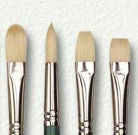
I expect that you the reader are now metaphorically scratching your head and saying what is the fellow on about. OK let me give an example. Acrylic/oil brushes come in different sizes and in four main shapes, round, long flat, short flat and filbert (after the nut of the same name) it is basically a flat brush with the corners rounded.
So what as a beginner I want to know is, how should each brush type best be used? What can I expect each brush type to do for me? What classic 'poor techniques' are there that I should avoid? How do things vary if I am using the paint thinly or thickly. I think many people will react to these question with mild incredulity and respond something like - "Well if you don't know and can't find the answer, just play with each for a bit and discover for yourself what each does best".
While this approach is great for most things at most times. It's not good here. Creating a representational painting is all about imagining the end result and getting there. Starting from an idea through turning that to a design/composition next the only way the painting comes about is by putting the paint from the palette on to the support (canvas/board/paper).
Let's take the example of a novice golfer. She may be able to imagine the where she wants the ball to go. What path she wants it to take. Yet her only way of achieving that outcome is by the single touch of the ball with her club head. No one would say it is reasonable to tell the golfing beginner to pick up a club and hit the ball a few times to get the idea and then leave it at that. So why is this reasonable with painting?
It isn't reasonable. The first person to make me see this was the painter Charles Reid. He has a wonderful book called
Painting Flowers in Watercolor.
In it he covers exactly, and I do mean exactly, how to load the watercolor brush with paint. How to place the stoke. What the paint should do once placed. If it does something else you have too much / too little water or your brush is not good enough. With practice and effort you can get things to happen as he describes. If you take the trouble to lean his approach and then use it. Easy to say, hard to do. Much easier to fall back on to one poor "self discovered" techniques. But if you do follow his technique then I guarantee you that your watercolour paintings will jump forward in quality.
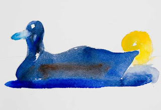
This brings me to my opening line of this post. The book, Charles Reid's book is not about painting flowers! It is about painting things that have lights/darks and colours. Yes the end result is that you are mainly painting flowers but realising they are just things, objects with shapes, light/dark and colour is a lot of the point.
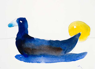
So what is the first thing he wants you to paint and paint again, using his intimately described brush techniques? - Yes you guessed it, it's the duck.
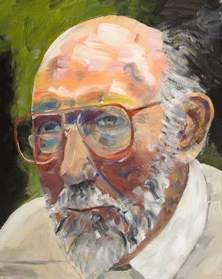
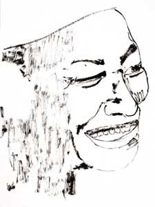
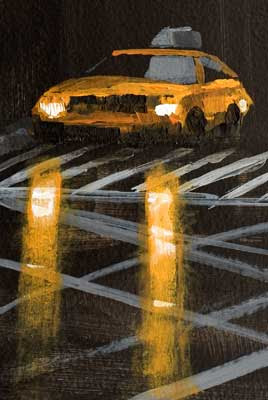
 Click Image to see larger version in my gallery
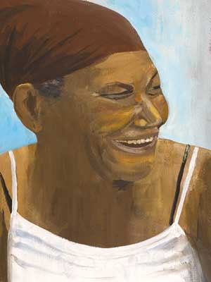
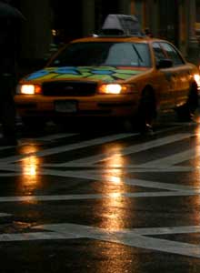
  The ref was taken in Venice back in April. For more pictures of Venice see the Photo side bar on the right in this blog.