I have been away for another week of "Painting with John Yardley". John does not really go in for teaching, he doesn't see himself as a teacher he runs the week more as a holiday. He paints every morning, 'en plein aire' if the weather allows. We are free to watch him and ask questions. He finishes the half sheet painting (
21 x 14 in - 53 x 36 cm) in around two hours it's extraordinarily impressive to watch.
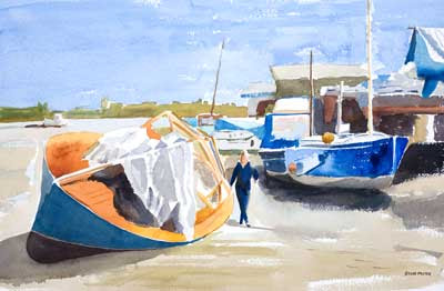
A John Yardley Painting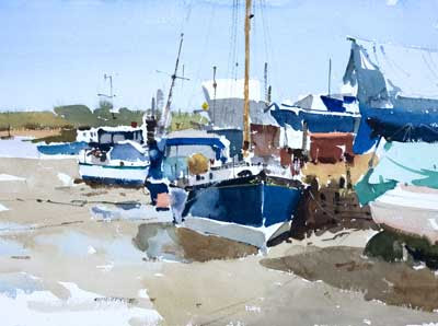
This is a painting that John did during the week. It is of boats on the Town Hard at Walton-on-the-Naze. He kindly lets us take photos of his work.
Below are three pieces of my work from our six days of painting.
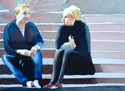
Painting at Dedham Hall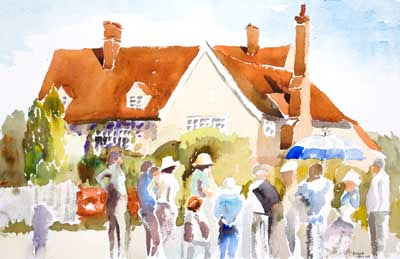 Click Image to see larger version in my gallery14 x 20 in - 35 x 51 cm Watercolor
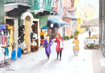
 Pleine aire is hard, well I find it hard. This was the first painting of the week and probably the best work I did all week.
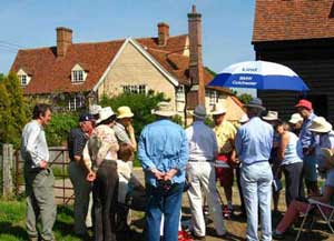
This is roughly the view I had while painting. This is the group of us watching John paint. I did the house en pleine air and added the people afterwards.
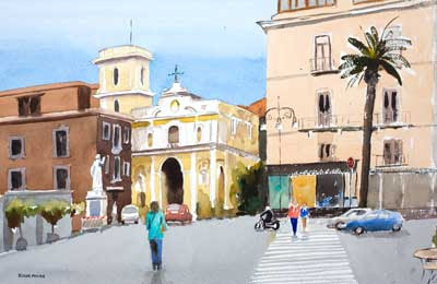
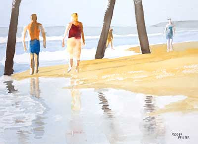
Walton-on-the-Naze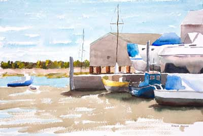 Click Image to see larger version in my gallery14 x 20 in - 35 x 51 cm Watercolor
 Not much I can say about this except that I am still clearly finding pleine aire hard.
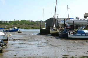
This is something like the view I had.
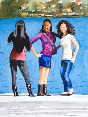
Venice Sparkle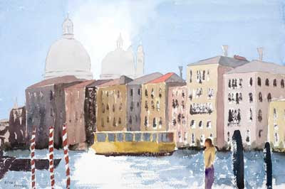 Click Image to see larger version in my gallery 14 x 20 in - 35 x 51 cm Watercolor
 Rain kept us in the studio on the Friday. This was my effort, done from a ref photo supplied by John.
AddendumFor photos from the course use these links
2008 2007 or go via the RogerPf's photos sidebar on the right. Note each gallery has a
slideshow option, use the link top right.
Addendum 2In the comments I have been asked what "plein aire" is? It is from the french "en pleine aire" meaning "out in the fresh air" as opposed to painting in the studio.
 Click Image to see larger version in my gallery
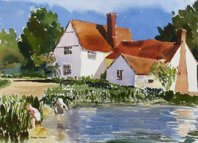
  The ref photo that I took a couple of years ago caught two children in the lower left. In the ref shown here I have photoshopped them to move them nearer the cottage. The children are of course, how the painting comes by its title.