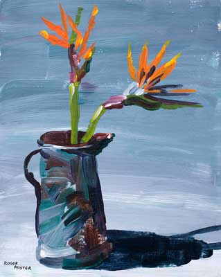
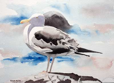
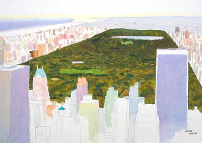
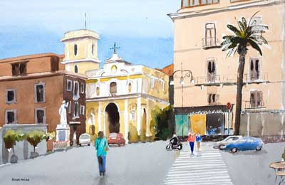
 Click Image to see larger version in my gallery10 x 14 in - 25 x 36 cm Watercolor
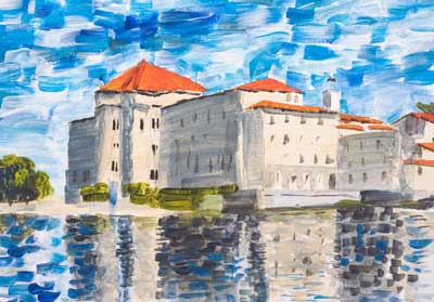
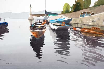
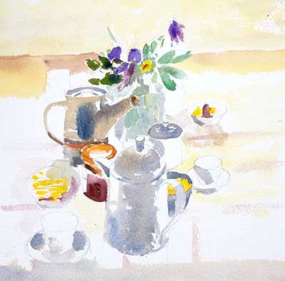
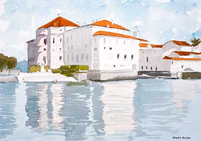
 This was another two hour challenge held at
PaintingFriends.comI concentrated on trying to get the refelection to look OK and to do it in the time allowed.

This is the reference slightly cropped from the original. Taken on Lake Maggiore in April this year.
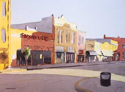
I took 5 mins thinking through the possible issues in the painting. The main thing, seemed to me, was to get the tones is right in the reflection. I noticed that the reflection of the bright walls are lighter than the real walls that are in shadow.
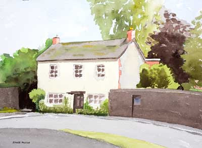
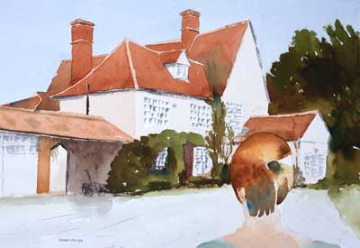
I took 20 minutes on the drawing. While drawing I knew perfectly well that some of the windows that I was draw would not have any paint on them so I was just using the pencil mark to indicate that there was something there. I have noticed John Singer Sargent do this in some of his watercolours and if it's good enough him then it's good enough for me.
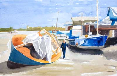
I finished in 1 hour 35 min. Yes I know I could have touched up a few places. A few more darks around the line where the land and sea meet would be an improvement. But I had basically done what I set out to do so the painting is, for me, "finished".
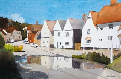
 Click Image to see larger version in my gallery
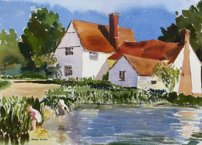
  I took this reference in late autumn in the early evening the sun as a way to my right and so the fronts of the houses that face the river are glowing in the sunlight.