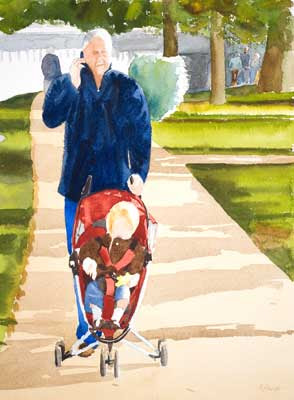
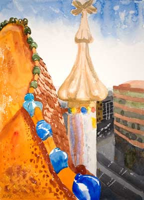
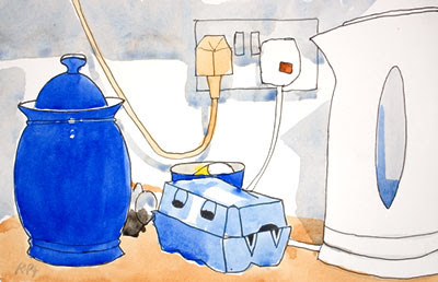
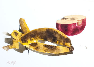
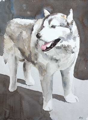
 Click Image to see larger version in my gallery 10 x 14 in - 25 x 36 cm.
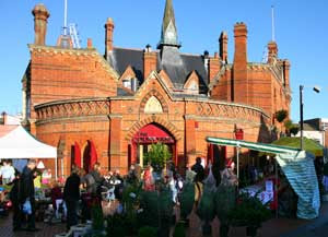
 Today one of the big UK mortgage lenders announced a survey which said that my town - Wokingham, Berks was the nicest place to live in the UK.
See thier claim here.
What really happened is that a few years ago the English county of Berkshire was broken up into separate "areas", one of these was given the name Wokingham of which my home town is at the center. By chance this new local government area has very few poor towns or zones in it. The result is that it does well in all the new reports that only take these areas as their basis. The truth is that there are lots of nice places to live in the UK and Wokingham nice though it is, is not that special.
To mark this survey I thought I would paint another local scene. If you want to see the others click the image above and then go 'up a level' to display their thumbnails.
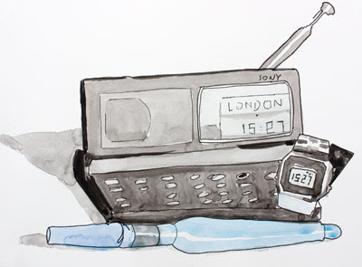
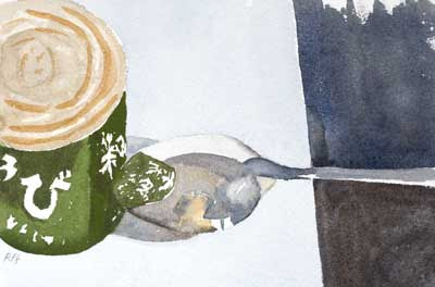
This one looks reasonable in thumbnail but looses purpose as you see bigger sizes.
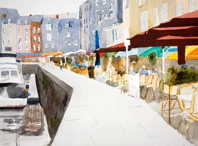
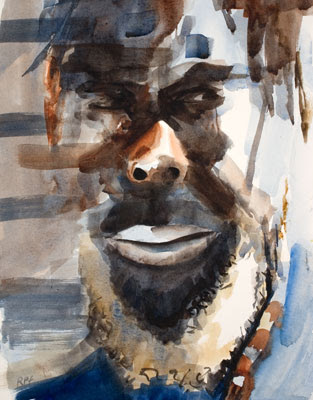
I always think that a painting should look more interesting that the reference photo it was painted from. If the photo looks better than the painting why bother with the painting?
As I you can see from the photo the eye tends to want to know about all the detail and of course this is lacking in the painting.
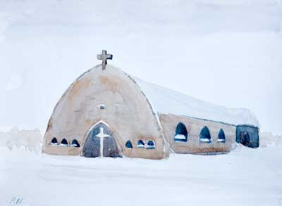
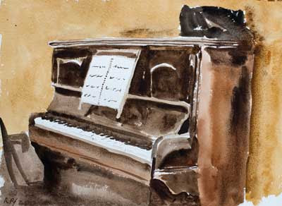 Click Image to see larger version in my gallery11 x 14 in - 28 x 36 cm. There will be a pause in posting new work for a few days so I thought I would show an oldie.