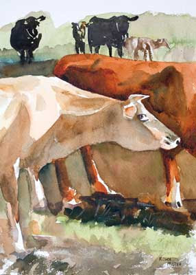
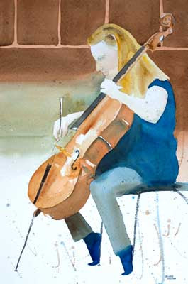
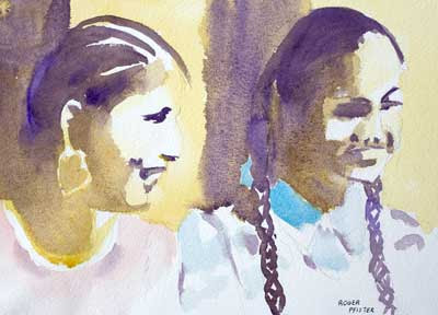
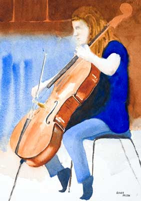
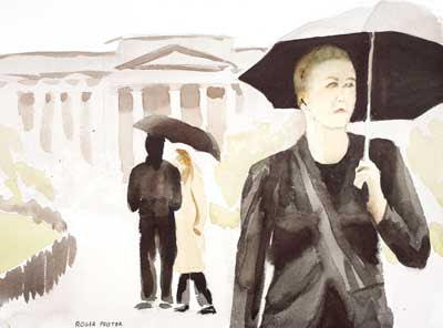
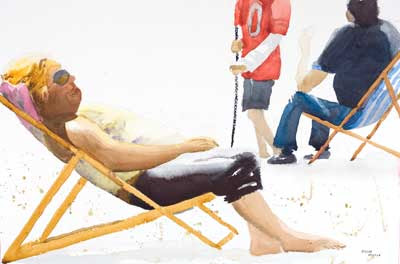
 Click Image to see larger version in my gallery
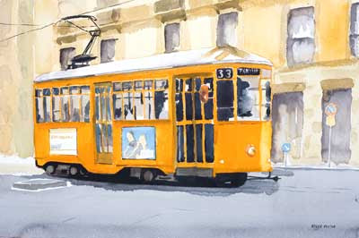
 21 x 14 in - 53 x 36 cm Watercolor This is another half sheet and as such the work has gone ok. If there is any appropriate general criticism is it would simply be that the work itself is a little un-interesting - okay, it's a tram but so what?
 The reference for this painting was taken in Milan a few days ago. You can see more images from that trip to Milan, Stresa and the Italian lakes by this clicking the link in the right-hand panel marked RogerPf's Photos. Stresa is pronounced Stray-za, but you must say it with an Italian accent.
Addendum
In the comments to this post Deb Townsend has suggested that pumping up the colour of the background building would improve things.
While this would be an improvement it runs the risk of drawing the eye to the strong colour in the building. A More effective solution would be to have painted the upper storey darker so throwing the roof of the tram into prominence.
I make it a rule never to go back and fiddle with actual paintings always better to use the time painting the next one; having first of course, remembered and learnt the lesson of the previous work. However there's nothing to stop me getting out Photoshop and trying out this approach.
 Yes that looks better. Now all I have to do is to remind myself to - think harder next time.