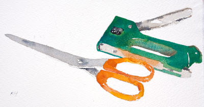
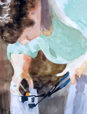
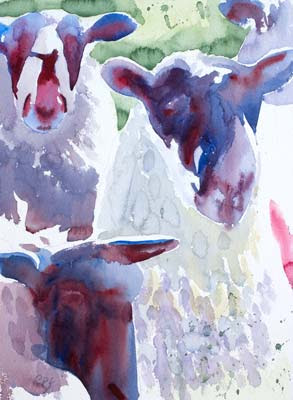
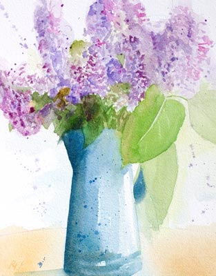
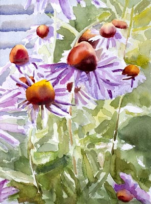
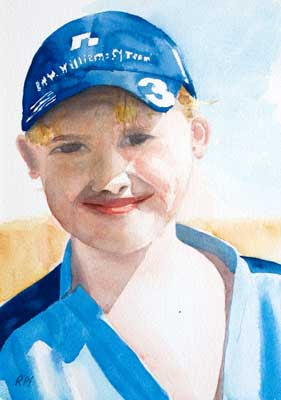
 Click Image to see larger version in my gallery
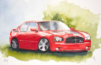
14 x 10 in - 36 x 25 cm.
This was done using the ultra traditional watercolour technique of multiple washes. This always take a while with lots of pauses to let the work dry before adding the next layer. The problem is that each wash is an opportunity to make a mistake.
I think I much prefer the faster "one touch" approach in which you attempt to get it right first time. OK, sometimes you know you will have to come back and restate an area but it the "one touch" approach you try to avoid such things as you plan out the painting.