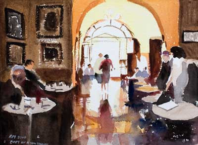
 Click Image to see larger version in my gallery
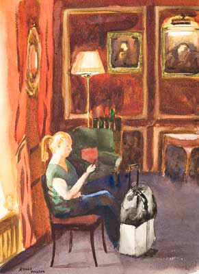
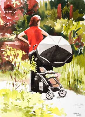
 14 x 10 in - 36 x 25 cm Watercolor I keep being nudged (gently nudged) by my critics to include more of a story in my paintings. While this one has a story, I'm not sure if, with the aid of the title, it will be understood by non-brit viewers.
I made an effort to do this in a watery Charles Reid style. It started well with the figure on the left. It got worse as I moved to the right and the green well it probably would have been better without the green.
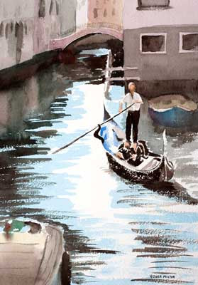
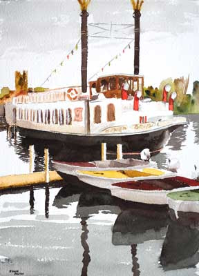
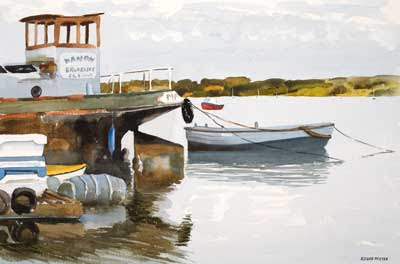
 The reference was taken while out from stroll on the Henley part of the Thames footpath in June 2004.
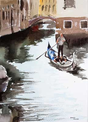